Piranesi Like Sunday Morning

History records that the psychedelic properties of LSD were discovered by Albert Hoffman in 1943, but anything more than the briefest glance at Piranesi’s Il Campo Marzio dell’antica Roma (The Campus Martius of Ancient Rome) suggests that some kind of extremely potent acid must have circulating among Italian antiquarians back in the 1760s.

Circus Domitiae? What even IS this?

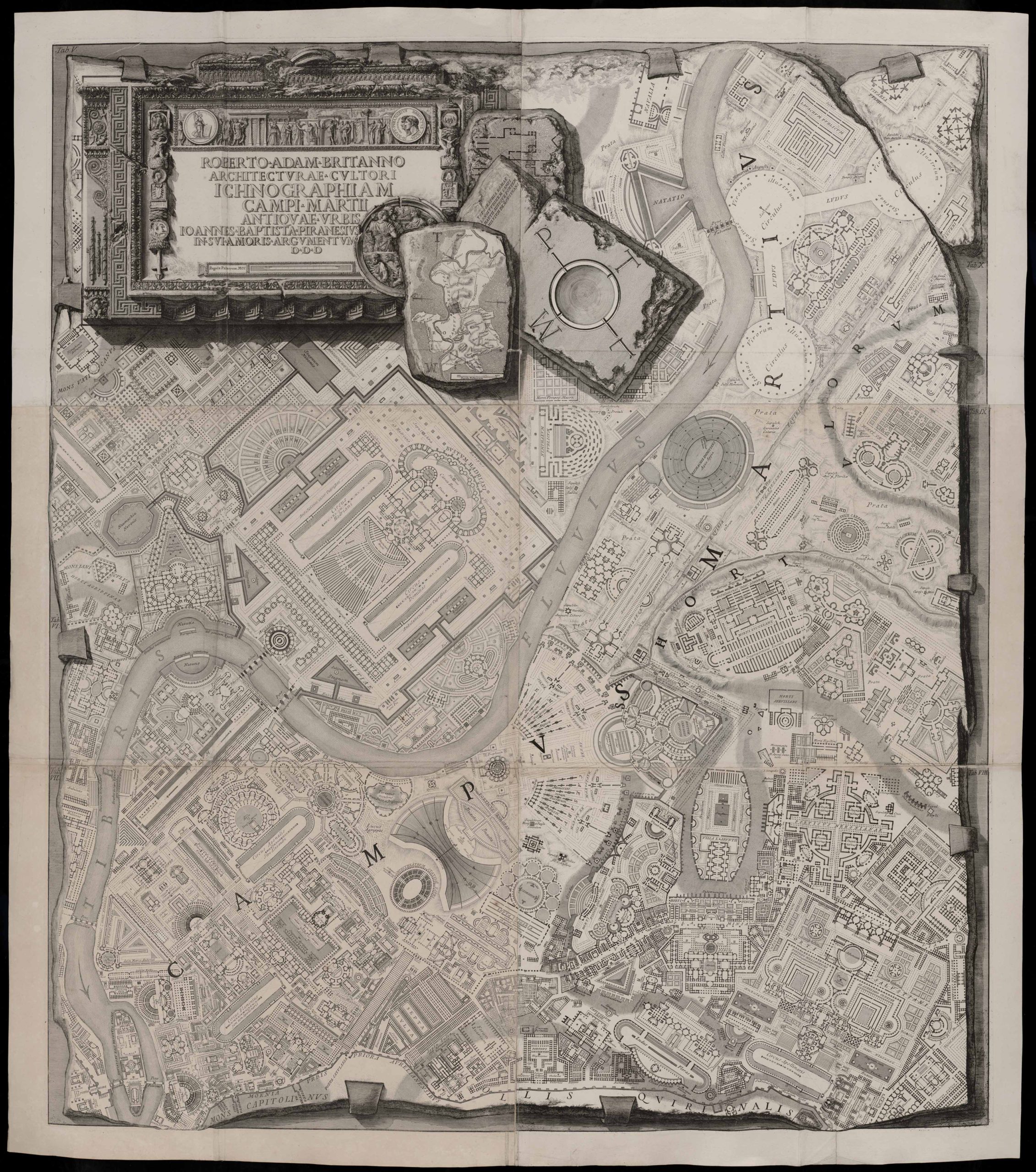
In producing his map of ancient Rome the artist, architect and antiquarian Giovanni Battista Piranesi (1720-1778) did an incredible job of tracking down, measuring and plotting structures that still stood in his day, then backed up his on-site research with meticulous trawling through ancient (and not so ancient – he straight up plagiarised some stuff from other antiquarians) documents for further info. Having done all that however he proceeded to fill in the blanks with the wildest, most hallucinatory, architectural bat-shittery imaginable, transforming Rome from a city where people actually lived and worked into a vast field of palaces, monuments, circuses, gardens, canals, lakes and god-knows what else. He even left off a few real features (where the hell is the Via Lata?) to make room for his architectural fever-dreams. It’s not a historical reconstruction, it’s an Imperial Disneyland with Marcus Mouse and Domitian Duck.

All that said, we shouldn’t be too harsh on him. Archeology as we understand it didn’t exist in the 1700s, and Piranesi was – above all else – a guy trying to earn a living. A map with big blank areas would be far less likely to attract the interest of a wealthy Grand Tourist than one full of fascinating – albeit entirely fictional – detail. It also cannot be denied that the piece is magnificent. I’d happily display it on my wall despite its historical shortcomings.

An interesting footnote is that there are two versions of the map. Piranesi actually went back and edited his depiction of the circuses, shortening the central spina (spinae? I really must brush up on my Latin plurals…) and replacing his straight depiction of the starting gates (the carceres) with curved ones. This was apparently down to evidence from the spectacularly well preserved Circus of Maxentius on the Appian Way south of Rome. Clare Hornsby delivered an interesting lecture on the subject at the English School in Rome back in 2022 which can be viewed here on YouTube.

And of course the whole thing was inspired by the Forma Urbis Romae – the incredibly detailed map of the city carved into marble slabs around 205 AD. This covered central Rome at such a level of detail that the floor plans of individual buildings – including features such as pillars and staircases – were included, and it was all clearly labeled with street and building names.

Such an incredible historical resource could – of course – not be permitted to survive and the majority of it was burned to make lime in the middle ages. About 10% of it survives in the form of thousands of fragments, and archeologists have been trying to fit them back together for the last few centuries in the most frustrating game of jigsaw ever devised.

Through such seas of ignorance, archeology splashes on!

Warhammer 40,000 Map Icons v6.0

Being the tragic geek that I am, I spent several months last year coding up an interactive map of the Warhammer 40,000 galaxy. What I came up with worked beautifully in Firefox on my fairly grunty, fairly new computer, but like an absolute dog with any other setup, so I’ve had no choice but to go back and start over from scratch – a prospect so disheartening that it will be many, many months before I can bring myself to look at it again, if ever.

The upside of this failed project however is that I ended up doing a complete revision of my Warhammer 40,000 map icons. And when I say complete revision I mean a radical change in the way they’re organised. So radical in fact that I’ve decided to leave version 5.0 available in this post for those who might prefer them, while making the new version available here.

The major changes in version 6.0 include…

Separation of Environment, Class and Affiliation: There are now separate sets of icons for the environment of a planet, how it’s categorised by the Imperium (ie: what ‘Class’ it is), and who controls it.

Consistent Colours: Each major faction now has a consistent colour scheme rather than the previous hodge-podge, so it’s easier to see who controls what at a glance.

Consistent Shapes: The sizes and shapes of icons are standardised rather than being all over the place with bits sticking out the sides.

Meaningful Shapes: Five different icons shapes are provided to represent planets/moons, space stations, dwarf planets/asteroids, fields/swarms and fleets/ships.

I’ve also added sub-faction specific icons so you can differentiate between (for example) Biel-Tan Eldar and Iyanden Eldar, or Mephrit Necrons and Sekemtar Necrons, should that be your idea of a morally acceptable good time.

I present the icons here in three formats

SVG Version  This is the version to use if you know what you’re doing with Vector graphics. If you’re making your map in a vector editor such as Illustrator or Inkscape this is the superior option. If you’re not, then one of the PNG versions will probably be more convenient.
DOWNLOAD

White PNG – An export of the Icons on a flat white background.
DOWNLOAD

Black PNG – An export of the Icons on a flat black background with a white glow effect.
DOWNLOAD

I should probably add a transparent PNG version, shouldn’t I? Maybe tonight…

Anyway, share and enjoy!

Zanzibar, Oh Zanzibar!

So there I was, watching Joanna Lumley’s Spice Trail Adventure on free-to-air tv last night like the dinosaur I am while waiting for Annika to come on and reflecting that if they’ve killed Tosh on Shetland (on after Annika) I would be extremely annoyed when this thing appeared on my screen.

That’s no moon Zanzibar!

This – according to ITV – is a map of the east African island of Zanzibar. Now, I had never to my knowledge seen a map of Zanzibar prior to last night, but I was pretty sure it doesn’t look like that. And the reason I’m pretty sure it doesn’t look like that is because that is clearly a map of the much, much larger east African island of Madagascar.

What absolutely baffles me about this is how it could possibly have happened. Someone in the ITV graphics department obviously put time and effort into creating an accurate map of the area around Zanzibar, and then slapped a map of Madagascar into the middle of it. They even took care to not cover up the smaller island of Tumbatu just to the west. It surely can’t be a mistake. Is it some kind of protest? Some kind of prank? And how did it get through to the final product without anyone noticing it?

Just sheer bafflement all around. I’m tempted to shoot them off an email to try and get to the bottom of it. Do better ITV!

Warhammer 40,000 Map Icons

UPDATE! Version 6.0 of the icon set is now available, but it’s a radical departure from previous versions, so I’m leaving version 5.0 here for those who might prefer the old style. Version 6.0

Many years ago I purchased the rulebook for the now sadly defuct Fantasy Flight Warhammer 40k RPG Dark Heresy. While I thought the game was great I was rather annoyed by the poor quality of the planet icons used in the provided map of the Calixis Sector, and being the kind of obsessive nerd I am I couldn’t help but make my own version of if where you could tell what planet was what without having to use a bright light and a magnifying glass.

One thing led to another and by 2019 I’d produced an entire library of icons for 40k maps, free for anyone to use, which could be found on Reddit.

Recently someone contacted me having problems downloading the icons, so I decided it was time to make some updates, and post the files here where I know where to find them without having to sort through my rather chaotic Reddit history.

So here it is – Version 5.0, for your downloading pleasure!

SVG Version – This is the version to use if you know what you’re doing with Vector graphics. If you’re making your map in a vector editor such as Illustrator or Inkscape this is the superior option. If you’re not, then one of the PNG versions will probably be more convenient. DOWNLOAD

Transparent PNG version – A PNG export of the SVG icons with transparency enabled. If your graphic editor works with transparent PNGs (which pretty much everything should these days) you should use this one. Each icon is rendered into two versions. One with no glow and one with a white glow suitable to paste onto a dark background. DOWNLOAD

Flat PNG Version – A PNG export of the SVG icons with no transparency. This is the last resort version for really old or simple graphic programs that can’t handle PNG transparency. There are two versions of each icon, one with no glow on a white background, and one with a white glow on a black background. DOWNLOAD

Enjoy!

Close Bitnami banner
Bitnami