Cartographic Armageddon

Guess what? I’m back on that 40k Mapping thing again!

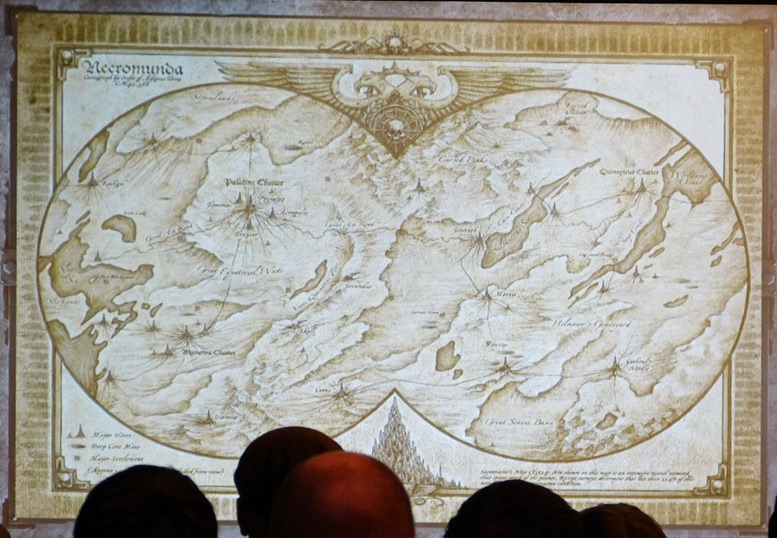
Behold Armageddon, one of the most fought over planets in the Imperium, with a Chaos invasion led by a Daemon Primarch, two Ork invasions led by Margaret Thatcher and the current general insanity caused by GW’s decision to move the plot forward under its belt.

Armageddon tired of GW's Cartographic Ignorance
Armageddon tired of GW’s Cartographic Failures…

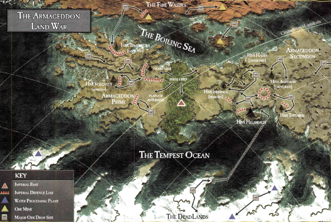
It’s a pretty nice map, however ever since its publication everyone at GW has completely forgotten how to read it.

Look at those lines. That’s right, the curved ones. They indicate that we’re not looking at a flat map, we’re looking at some kind of globular projection. Furthermore notice that the lines are slanted – that means that we’re not looking at the map from a  cardinal direction (north, south, east or west), but at an angle. And hey! Look in the upper right hand corner! One of the lines is marked as the equator! This tells us that north is to the upper left!

NORTH IS THAT WAY!!!

Unfortunately this is something that has escaped the notice of GW’s writers and artists who have consistently read it as a flattened, north oriented map, even publishing redraws of it with an upwards pointing compass rose slapped on top – most notably in the recent reprint of Gavin Thorpe’s Annihilation Squad (a damn good read actually, despite the compass directions being all screwy BECAUSE NO ONE AT GW CAN READ A GODDAMN MAP!).

Perhaps the silliest aspect of this are the planet’s famous equatorial jungles. If we look at the map above we can see that this name makes sense – they sit right across the planet’s equator. If we go by the later maps however they’re just randomly plonked running north to south, giving one the impression that whatever Ordo Cartographica scribe first charted the planet was hitting the amasec really hard.

So, what to do about this all this malarkey (apart from making a ranting blog post that no one else will ever care about)? Why, redraft the map of course!

Now, this is a bit easier said than done. The globular projection adds all kinds of distortions and while I am sure there is software out there that can correct them in the twinkling of a nurgling’s eye I don’t have access to them. So I decided to go old school and resort to paper and pencil.

Step one was to make the map grid a bit denser. I did this by tracing the existing grid in Inkscape and then running additional lines between each of them, splitting each of the existing map squares into four. Step two was to grab a piece of graph paper and sketch in the details of each square…

armageddon_map_corrected
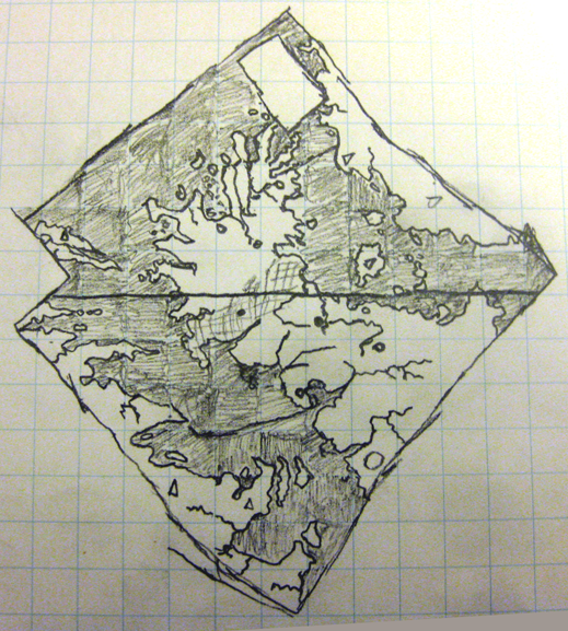
So there we have it! That’s what a flattened out, north oriented Armageddon map really looks like! Armageddon Primus is actually north of Armageddon Secundus and the entire continent is stumpier than the angled view suggests

So, I now expect GW to start using this corrected version immediately! ;D

EDIT: Yes, it is rather strange that the continent to the west (the Dead Lands) is completely frozen over while the central continent (at the same latitudes) isn’t. There’s a clue to this in that the eastern continent (the Fire Wastes) appear to be barren desert. This would suggest that Armageddon has a pretty severe axial tilt combined with some rather weird orbital characteristics – which given its ancient history (no spoilers, but go read The Beast Arises…) is actually rather plausible.

Meanwhile on Necromunda

Ah Necromunda! Hive world of hive worlds! Star of the Araneus Continuity! The planet so trashed that they’re refining the waste left over from the last time they refined the waste just to keep things going! How we love thee!

What the hell am I on about you ask? Predictably it’s Warhammer 40,000 again and in particular the relaunch of Games Workshop’s skirmish combat game Necromunda, set in the collapsing, polluted, gang-ridden underbelly of the planet’s largest hive city.

“But” you say “Necromunda was relaunched months ago! Why are you only babbling about it now?”. Good question. Well, maybe not such a good question because the Wyrmlog has been in a state of deep torpor for months. But still, what is my point? Have I bought the game and am engaged in an engrossing campaign with my friends?

Ha! Of course not! Do I look like I’ve sold a kidney?

(Really? Wow, I should probably eat some vegetables or something hey?)

Anyway, no I have not bought a copy because I plan on eating for the next few months. I have however been keeping an eye on the whole thing because I am a nerd and that’s what nerds do.

And in keeping an eye on the whole thing I stumbled across a series of photographs taken at the Horus Heresy/Necromunda Weekender event GW threw a month or so back. Among them was this…

Necromunda Map
Image Source – https://recalcitrantdaze.blogspot.com.au/

…which really got my sci-fi-nerd and map-nerd juices really running. A map of the entire planet!!!

Except… It’s really not…

As a piece of art it’s undoubtedly great. As a map it fails badly.

It’s clearly mimicking the look of an antique Nicolosi Globular projection map…

MAWO-62++World+Map+1670++Antique+Framed+Maps

…but the artist seems to have not understood how a globular projection works and just drawn the details as if it’s some kind of rectangular projection with bits chopped off to fit in the frame. This is particularly noticeable in that the east and west edges of the map don’t match up – water bodies just vanish off one side and don’t show up on the other! HERESY! CARTOGRAPHIC HERESY!

Faced with this insult to generations of map makers I had no choice. I had to redraw the entire thing properly.

I started by assuming that the original map is a equirectangular projection – not unreasonable I think given that that’s how most people think maps work. I expanded it on both sides to make room for a strip of land linking the east and west edges, and added space to the top and bottom to account for the poles. I then filled these spaces in with plausible detail (ie: made a bunch of stuff up).

With that completed I ran the result through NASA’s G.Projector tool to render it into a proper global projection. A bit of cleanup and labeling later, I ended up with this. Behold its Majesty!

f2

The Worldsump Ocean may be much larger than I show it and I had to squint to try and read some of the labels in the southwest section of the original, but overall I’m pretty happy with it.

The lesson to be drawn from all this? Never underestimate the lengths an Aspie will go to to correct problems in properties they care about! ;D

On the Superiority of Cylindrical Equal-Area Projections

An ignorant American cartography professor and Apple-Maps developer was teaching a class on Gerardus Mercator, known DST advocate. “Before the class begins, you must get on your knees and worship Mercator and accept that he was the most highly-evolved cartographer the world has ever known, even greater than James Gall and Arno Peters!” At this moment, a brave, logical European Redditor who was a long-time contributor to sporcle.com and understood the superiority of cylindrical equal-area projections stood up and held up a globe. “What is the largest continent, pinhead?” The arrogant professor smirked quite Euro-centrically and smugly replied “Greenland, you stupid pleb! Can’t you see how much larger it is than Africa?” “Wrong,” said the student, and drew a perfect circle encompassing Greenland (which isn’t even green smh), “if Greenland is so big, how come there are more people outside this circle than inside?” The professor was visibly shaken, and dropped his chalk and copy of Nova et Aucta Orbis Terrae Descriptio ad Usum Navigantium Emendate Accommodata. He stormed out of the room crying those distorted conformal Mercator tears, his world collapsing around him. There is no doubt that at this point our professor, Alphons J. Van der Grinten, wished he had received a European education and become more than yet another distributor of lies in our flawed education system, and was kicking himself for never noticing that India has a greater north-south extent than Finland. The students applauded and all subscribed to /r/mapporn that day and accepted the Peirce Quincuncial projection as the coolest projection ever. There was a school-wide renouncement of outdated colonialist maps, and south-up maps (like the ones they definitely 100% use in Australia) were hung up across the northern hemisphere. God himself showed up and enforced geography as a mandatory subject in schools nationwide. The professor lost his tenure and was fired the next day. He committed suicide and his body was tossed into the Mariana trench. And that student’s name? Harry Beck, creator of the London Tube map.

(Not mine, but so good I had to share!)

Close Bitnami banner
Bitnami