Ah Necromunda! Hive world of hive worlds! Star of the Araneus Continuity! The planet so trashed that they’re refining the waste left over from the last time they refined the waste just to keep things going! How we love thee!
What the hell am I on about you ask? Predictably it’s Warhammer 40,000 again and in particular the relaunch of Games Workshop’s skirmish combat game Necromunda, set in the collapsing, polluted, gang-ridden underbelly of the planet’s largest hive city.
“But” you say “Necromunda was relaunched months ago! Why are you only babbling about it now?”. Good question. Well, maybe not such a good question because the Wyrmlog has been in a state of deep torpor for months. But still, what is my point? Have I bought the game and am engaged in an engrossing campaign with my friends?
Ha! Of course not! Do I look like I’ve sold a kidney?
(Really? Wow, I should probably eat some vegetables or something hey?)
Anyway, no I have not bought a copy because I plan on eating for the next few months. I have however been keeping an eye on the whole thing because I am a nerd and that’s what nerds do.
And in keeping an eye on the whole thing I stumbled across a series of photographs taken at the Horus Heresy/Necromunda Weekender event GW threw a month or so back. Among them was this…
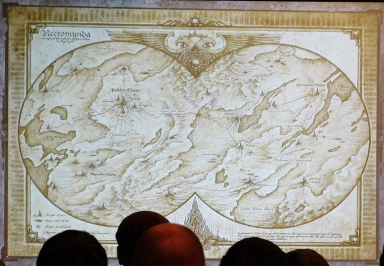
…which really got my sci-fi-nerd and map-nerd juices really running. A map of the entire planet!!!
Except… It’s really not…
As a piece of art it’s undoubtedly great. As a map it fails badly.
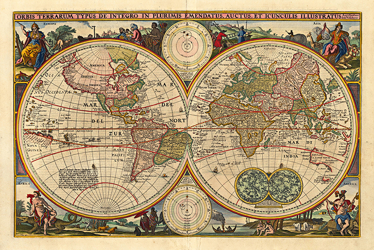
It’s clearly mimicking the look of an antique Nicolosi Globular projection map…
…but the artist seems to have not understood how a globular projection works and just drawn the details as if it’s some kind of rectangular projection with bits chopped off to fit in the frame. This is particularly noticeable in that the east and west edges of the map don’t match up – water bodies just vanish off one side and don’t show up on the other! HERESY! CARTOGRAPHIC HERESY!
Faced with this insult to generations of map makers I had no choice. I had to redraw the entire thing properly.
I started by assuming that the original map is a equirectangular projection – not unreasonable I think given that that’s how most people think maps work. I expanded it on both sides to make room for a strip of land linking the east and west edges, and added space to the top and bottom to account for the poles. I then filled these spaces in with plausible detail (ie: made a bunch of stuff up).
With that completed I ran the result through NASA’s G.Projector tool to render it into a proper global projection. A bit of cleanup and labeling later, I ended up with this. Behold its Majesty!
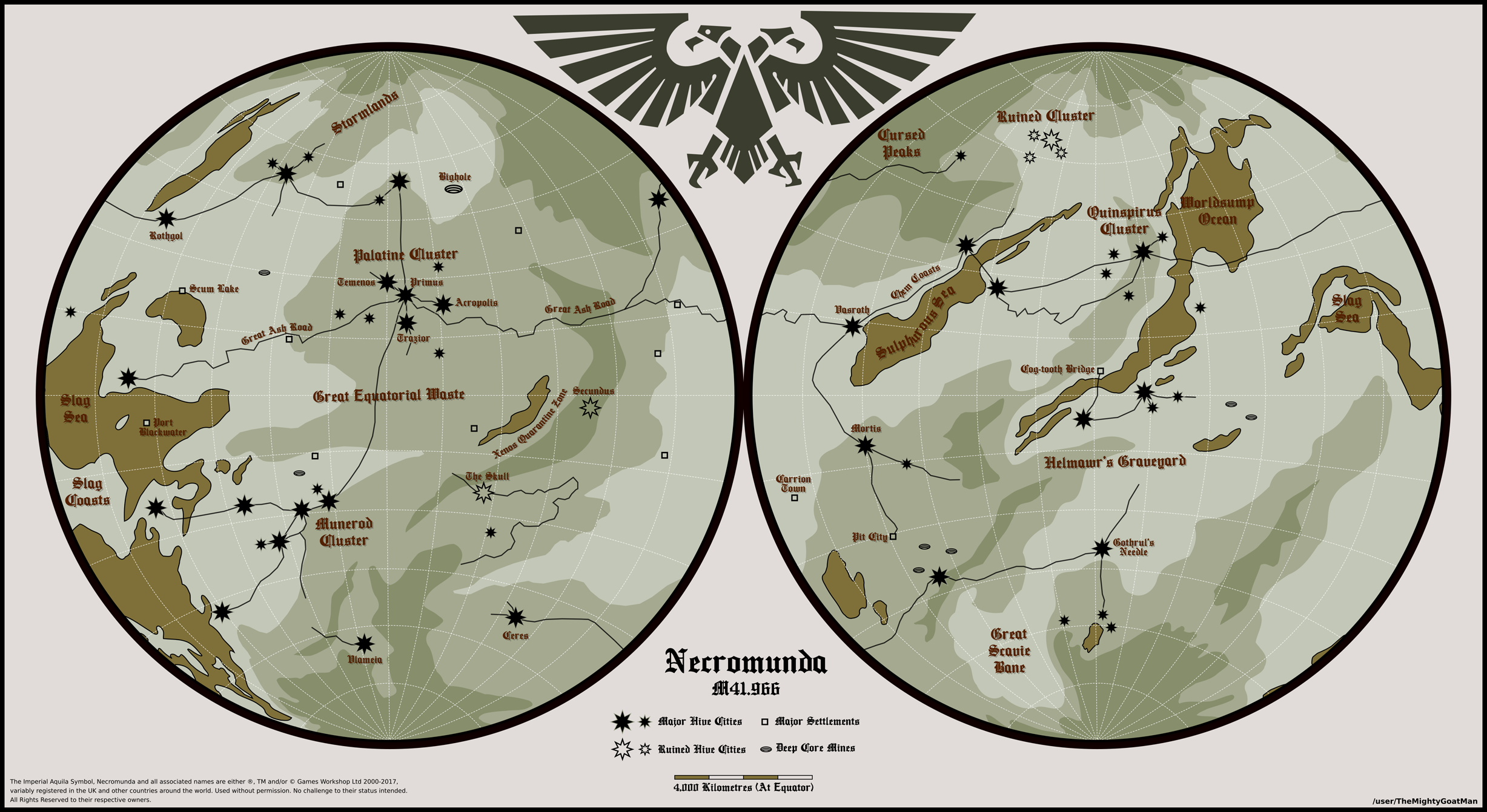
The Worldsump Ocean may be much larger than I show it and I had to squint to try and read some of the labels in the southwest section of the original, but overall I’m pretty happy with it.
The lesson to be drawn from all this? Never underestimate the lengths an Aspie will go to to correct problems in properties they care about! ;D